<!doctype html>
<html lang="en-us">
<head>
<script>
(function(i,s,o,g,r,a,m){i['GoogleAnalyticsObject']=r;i[r]=i[r], function(){
(i[r].q=i[r].q, []).push(arguments)},i[r].l=1*new Date();a=s.createElement(o),
m=s.getElementsByTagName(o)[0];a.async=1;a.src=g;m.parentNode.insertBefore(a,m)
})(window,document,'script','https://www.google-analytics.com/analytics.js','ga');
ga('create', 'UA-10701068-1', 'auto');
ga('send', 'pageview');
ga('send', 'event', 'error-page', 'open', 'website-sleeping');
</script>
<meta charset=utf-8>
<meta content="width=device-width,initial-scale=1.0,minimum-scale=1.0,maximum-scale=5.0" name=viewport>
<meta name="HandheldFriendly" content="True">
<title>Website sleeping, 000webhost</title>
<link rel="shortcut icon" type="image/x-icon" href="https://cdn.000webhost.com/000webhost/logo/favicon.ico">
<link href="https://fonts.googleapis.com/css?family=Roboto:400,700&display=swap" rel="preconnect stylesheet">
<style>html, body {
font-family: 'Roboto', sans-serif;
font-size: 0.85vw;
-ms-text-size-adjust: 100%;
-webkit-text-size-adjust: 100%;
background-color: white;
-webkit-font-smoothing: antialiased;
}
body {
margin: 0;
padding: 0;
display: flex;
display: -webkit-box;
display: -ms-flexbox;
display: flex;
-webkit-box-orient: vertical;
-webkit-box-direction: normal;
-ms-flex-direction: column;
flex-direction: column;
align-items: center;
-webkit-box-align: center;
-moz-box-align: center;
-ms-flex-align: center;
-webkit-align-items: center;
justify-content: flex-start;
}
p {
-webkit-margin-after: 0px;
-webkit-margin-before: 0px;
font-size: 15px;
color: #7F828B;
line-height: 21px;
margin-bottom: 4px;
}
h1, h2, h3, h4, h5, h6 {
font-weight: normal;
margin: 0;
}
img {
max-width: 100%;
height: auto;
}
.container {
padding: 0 5%;
width: 90%;
}
.flex {
display: -webkit-box;
display: -ms-flexbox;
display: flex;
}
.flex-column {
-webkit-box-orient: vertical;
-webkit-box-direction: normal;
-ms-flex-direction: column;
flex-direction: column;
}
.full-width {
width: 100%;
}
.full-height {
height: 100%;
}
.align-items-center {
-webkit-box-align: center;
-ms-flex-align: center;
align-items: center;
}
.align-self-end {
align-self: flex-end;
}
.justify-content-between {
-webkit-box-pack: justify;
-ms-flex-pack: justify;
justify-content: space-between;
}
.justify-content-evenly {
justify-content: space-evenly;
}
.justify-content-center {
-webkit-box-pack: center;
-ms-flex-pack: center;
justify-content: center;
}
.flex-row-col-768 {
-webkit-box-orient: horizontal;
-webkit-box-direction: normal;
-ms-flex-direction: row;
flex-direction: row;
}
@media (max-width: 768px) {
.flex-row-col-768 {
-webkit-box-orient: vertical;
-webkit-box-direction: normal;
-ms-flex-direction: column;
flex-direction: column;
}
}
.bg-white {
background-color: white;
}
.bg-white-two {
background-color: #f8f8f8;
}
.text-bold {
font-weight: bold;
}
.text-center {
text-align: center;
}
.text-charcoal-grey {
color: #32454c;
}
.text-battleship-grey {
color: #6f7c81;
}
.text-coral-pink {
color: #ff5c62;
}
.logo-holder {
width: 17%;
margin-top: 3.25vh;
margin-bottom: 6vh;
}
.top-section {
height: 100vh;
}
.bottom-section {
padding: 8rem 0;
}
.heading-1 {
font-size: 3rem;
line-height: 1.25;
}
.heading-2 {
font-size: 2.25rem;
line-height: 1.33;
}
.heading-3 {
font-size: 1.5rem;
line-height: 1.33;
}
.heading-4 {
font-size: 1.1rem;
line-height: 1.5;
letter-spacing: 0.5px;
}
.paragraph {
font-size: 1.1rem;
line-height: 1.71;
letter-spacing: 0.5px;
}
.mb-10 {
margin-bottom: 10px;
}
.mb-20 {
margin-bottom: 20px;
}
.mb-30 {
margin-bottom: 30px;
}
.mb-50 {
margin-bottom: 50px;
}
.mb-70 {
margin-bottom: 70px;
}
.mr-30 {
margin-right: 30px;
}
.image-holder {
-webkit-box-flex: 1;
-ms-flex: 1 0;
flex: 1 0;
position: relative;
width: 71vh;
max-width: 100%;
-webkit-box-align: end;
-ms-flex-align: end;
align-items: flex-end;
}
.main-image {
width: 100%;
}
/* —– Button Styling Start —– */
.button {
position: relative;
display: -ms-inline-flexbox;
display: inline-flex;
-webkit-box-sizing: border-box;
box-sizing: border-box;
-webkit-box-pack: center;
-ms-flex-pack: center;
justify-content: center;
-webkit-box-align: center;
-ms-flex-align: center;
align-items: center;
border-radius: 0.33rem;
padding: 1rem 30px;
min-width: 64px;
min-height: 44px;
vertical-align: middle;
text-align: center;
-o-text-overflow: ellipsis;
text-overflow: ellipsis;
text-transform: uppercase;
text-decoration: none;
font-family: "Roboto", "Segoe UI", BlinkMacSystemFont, system-ui, -apple-system;
font-size: 1.15rem;
font-weight: bold;
overflow: hidden;
outline: none;
cursor: pointer;
-webkit-transition: -webkit-box-shadow 0.2s;
transition: -webkit-box-shadow 0.2s;
-o-transition: box-shadow 0.2s;
transition: box-shadow 0.2s;
transition: box-shadow 0.2s, -webkit-box-shadow 0.2s;
}
/* Overlay */
.button:before {
content: "";
position: absolute;
top: 0;
left: 0;
background-color: rgb(255, 255, 255);
opacity: 0;
-webkit-transition: opacity 0.2s;
-o-transition: opacity 0.2s;
transition: opacity 0.2s;
}
.button:hover:before {
opacity: 0.08;
}
.button:focus:before {
opacity: 0.24;
}
.button:hover:focus:before {
opacity: 0.3;
}
.button:active:after {
opacity: 0.32;
-webkit-transform: translate(-50%, -50%) scale(0);
-ms-transform: translate(-50%, -50%) scale(0);
transform: translate(-50%, -50%) scale(0);
-webkit-transition: -webkit-transform 0s;
transition: -webkit-transform 0s;
-o-transition: transform 0s;
transition: transform 0s;
transition: transform 0s, -webkit-transform 0s;
}
/* —– Primary Button Start —– */
.button–primary {
border: none;
color: rgb(255, 255, 255);
background-color: #ff5c62;
-webkit-box-shadow: 0 2px 12px -6px #cc292f;
box-shadow: 0 2px 12px -6px #cc292f;
}
/* Hover, Focus */
.button–primary:hover, .button–primary:focus {
color: rgb(255, 255, 255);
-webkit-box-shadow: 0 2px 16px -6px #cc292f;
box-shadow: 0 2px 16px -6px #cc292f;
}
/* Active */
.button–primary:active {
-webkit-box-shadow: 0 6px 20px -6px #cc292f;
box-shadow: 0 6px 20px -6px #cc292f;
}
/* Ripple */
.button–primary:after {
content: "";
position: absolute;
left: 50%;
top: 50%;
border-radius: 50%;
width: 20rem; /* Safari */
height: 20rem; /* Safari */
background-color: rgb(255, 255, 255);
opacity: 0;
-webkit-transform: translate(-50%, -50%) scale(1);
-ms-transform: translate(-50%, -50%) scale(1);
transform: translate(-50%, -50%) scale(1);
-webkit-transition: opacity 1s, -webkit-transform 0.5s;
transition: opacity 1s, -webkit-transform 0.5s;
-o-transition: opacity 1s, transform 0.5s;
transition: opacity 1s, transform 0.5s;
transition: opacity 1s, transform 0.5s, -webkit-transform 0.5s;
}
/* —– Primary Button End —– */
/* —– Secondary Button Start —– */
.button–secondary {
border: solid 1px #ff5c62;
color: #ff5c62;
background-color: transparent;
}
/* Hover, Focus */
.button–secondary:hover, .button–secondary:focus {
color: #ff5c62;
background-color: rgba(255, 92, 98, 0.1)
}
/* Active */
.button–secondary:active {
background-color: rgba(255, 92, 98, 0.3);
}
/* Ripple */
.button–secondary:after {
content: "";
position: absolute;
left: 50%;
top: 50%;
border-radius: 50%;
width: 20rem; /* Safari */
height: 20rem; /* Safari */
background-color: rgba(255, 92, 98, 0.3);
opacity: 0;
-webkit-transform: translate(-50%, -50%) scale(1);
-ms-transform: translate(-50%, -50%) scale(1);
transform: translate(-50%, -50%) scale(1);
-webkit-transition: opacity 1s, -webkit-transform 0.5s;
transition: opacity 1s, -webkit-transform 0.5s;
-o-transition: opacity 1s, transform 0.5s;
transition: opacity 1s, transform 0.5s;
transition: opacity 1s, transform 0.5s, -webkit-transform 0.5s;
}
/* —– Secondary Button End —– */
/* —– Button Styling End —– */
/* —– Scroll Icon —– */
.scroll-holder {
position: absolute;
text-align: center;
bottom: 3.75rem;
}
.scroll-holder–mobile {
display: none;
}
.icon-scroll:before {
position: absolute;
}
.icon-scroll {
margin: 0 auto 1.75rem auto;
position: relative;
width: 2.5rem;
height: 4.3rem;
-webkit-box-shadow: inset 0 0 0 0.3rem #ff5c62;
box-shadow: inset 0 0 0 0.3rem #ff5c62;
border-radius: 25px;
}
.icon-scroll:before {
content: '';
width: 0.5rem;
height: 0.5rem;
background: #ff5c62;
margin-left: -0.25rem;
top: 0.5rem;
border-radius: 4px;
-webkit-animation-duration: 1.5s;
animation-duration: 1.5s;
-webkit-animation-iteration-count: infinite;
animation-iteration-count: infinite;
-webkit-animation-name: scroll;
animation-name: scroll;
}
.text-scroll {
font-size: 1.1rem;
}
@-webkit-keyframes scroll {
0% {
opacity: 1;
}
100% {
opacity: 0;
-webkit-transform: translateY(2.8rem);
transform: translateY(2.8rem);
}
}
@keyframes scroll {
0% {
opacity: 1;
}
100% {
opacity: 0;
-webkit-transform: translateY(2.8rem);
transform: translateY(2.8rem);
}
}
.card-holder {
max-width: 90%;
}
.card {
padding: 40px;
border-radius: 3px;
-webkit-box-shadow: 0 1px 12px 1px rgba(50, 69, 76, 0.1);
box-shadow: 0 1px 12px 1px rgba(50, 69, 76, 0.1);
-ms-flex-preferred-size: 35%;
flex-basis: 35%;
}
.card–spaced {
margin: 0 30px 0 0;
}
.card__image-holder {
-webkit-box-flex: 1;
-ms-flex: 1 0 auto;
flex: 1 0 auto;
padding-bottom: 40px;
-webkit-box-align: start;
-ms-flex-align: start;
align-items: flex-start;
}
.main-ctas–mobile {
display: none;
-webkit-box-ordinal-group: 3;
-ms-flex-order: 2;
order: 2;
margin-bottom: 30px;
}
@media screen and (min-width: 992px) and (max-width: 1199px) {
html {
font-size: 1.3vh;
}
}
@media screen and (max-width: 991px) {
html {
font-size: 12px;
}
}
@media screen and (max-width: 768px) {
.logo-holder {
width: 50%;
max-width: 155px;
}
.card-holder {
max-width: 100%;
}
.card–spaced {
margin: 0 0 30px 0;
}
}
@media screen and (max-width: 480px) {
.heading-1 {
font-size: 2.25rem;
}
.logo-holder {
width: 40%;
margin-top: 3vh;
margin-bottom: 5vh;
}
.main-ctas {
display: none;
}
.main-ctas__button {
-webkit-box-flex: 1;
-ms-flex: 1 1 auto;
flex: 1 1 auto;
}
.main-ctas__button–spaced {
margin-right: 5%;
}
.main-ctas–mobile {
display: -webkit-box;
display: -ms-flexbox;
display: flex;
display: -webkit-flex;
}
.button {
padding: 0.5em 20px;
}
.scroll-holder {
display: none;
}
.scroll-holder–mobile {
display: -webkit-box;
display: -ms-flexbox;
display: flex;
display: -webkit-flex;
-webkit-box-orient: vertical;
-webkit-box-direction: normal;
-ms-flex-direction: column;
flex-direction: column;
height: 100%;
-webkit-box-pack: center;
-ms-flex-pack: center;
justify-content: center;
}
.icon-scroll {
width: 24px;
height: 36px;
margin: 0 auto 5px auto;
}
.icon-scroll:before {
left: 50%;
width: 4px;
height: 4px;
margin-left: -2px;
top: 0;
}
.card {
padding: 20px;
}
.card__button {
width: 100%;
}
}
</style>
</head>
<body>
<div class="container">
<div class="top-section flex flex-column full-width align-items-center">
<div class="logo-holder">
<img src="https://cdn.000webhost.com/000webhost/logo/000webhost-logo-coral-pink.svg" class="full-width" alt="000webhost logo">
</div>
<div class="content">
<h1 class="heading-1 text-bold text-center text-charcoal-grey mb-10">Website is sleeping</h1>
<h2 class="heading-4 text-center text-battleship-grey mb-30">If you are the website owner you can wake website from sleep in the members area.</h2>
</div>
<div class="flex justify-content-evenly main-ctas">
<a class="button button–primary mr-30 main-ctas__button" href="https://www.000webhost.com/cpanel-login?utm_source=000&utm_medium=website-sleeping&utm_campaign=pages">Wake website from sleep</a>
<a class="button button–secondary main-ctas__button" href="https://www.000webhost.com/?utm_source=000webhost&utm_medium=frontend&utm_campaign=website-sleeping">Visit 000Webhost Homepage</a>
</div>
<div class="justify-content-between main-ctas–mobile full-width">
<a class="button button–primary main-ctas__button main-ctas__button–spaced" href="https://www.000webhost.com/cpanel-login?utm_source=000&utm_medium=website-sleeping&utm_campaign=pages">Wake your site</a>
<a class="button button–secondary main-ctas__button" href="https://www.000webhost.com/?utm_source=000webhost&utm_medium=frontend&utm_campaign=website-sleeping">Homepage</a>
</div>
<div class="scroll-holder–mobile">
<div class="icon-scroll"></div>
<span class="text-coral-pink text-bold text-scroll">SCROLL DOWN</span>
</div>
<div class="image-holder flex justify-content-center">
<img src="https://cdn.000webhost.com/000webhost/000webhost-pages/corgi-sleeping-on-a-table.svg" class="main-image" alt="Dog sleeping on a laptop">
<div class="scroll-holder">
<div class="icon-scroll"></div>
<span class="text-coral-pink text-bold text-scroll">SCROLL DOWN</span>
</div>
</div>
</div>
</div>
<div class="container bg-white-two">
<div class="bottom-section flex flex-column full-width align-items-center">
<h2 class="heading-2 text-bold text-center text-charcoal-grey mb-50">You can also try one of these options!</h2>
<div class="card-holder flex flex-row-col-768 justify-content-center mb-70">
<div class="flex flex-column card card–spaced bg-white">
<div class="flex justify-content-center card__image-holder">
<img src="https://cdn.000webhost.com/000webhost/000webhost-pages/corgi-upgrade-to-hostinger.svg" class="full-width" alt="">
</div>
<h3 class="heading-3 text-bold text-center text-charcoal-grey mb-10">Upgrade to Hostinger</h3>
<p class="paragraph text-battleship-grey text-center mb-20">
By upgrading to premium hosting you will unlock all available features, more disk space, and bandwidth. Also, you will not have to worry about your website going to sleep ever again!
</p>
<div class="flex justify-content-center full-height">
<a class="button button–primary card__button align-self-end" href="https://www.hostinger.com/special/000webhost?utm_source=000webhost&utm_medium=frontend&utm_campaign=website-sleeping">Upgrade Now</a>
</div>
</div>
<div class="flex flex-column card bg-white">
<div class="flex justify-content-center card__image-holder">
<img src="https://cdn.000webhost.com/000webhost/000webhost-pages/corgi-make-a-website.svg" class="full-width" alt="">
</div>
<h3 class="heading-3 text-bold text-center text-charcoal-grey mb-10">Create Your Own Website</h3>
<p class="paragraph text-battleship-grey text-center mb-20">
If you're just a visitor of the page – try creating your own website for free and get it up and running in just a matter of seconds. Your dream website is waiting for you!
</p>
<div class="flex justify-content-center full-height">
<a class="button button–primary card__button align-self-end" href="https://www.000webhost.com/free-website-sign-up?utm_source=000webhost&utm_medium=frontend&utm_campaign=website-sleeping">Get Started</a>
</div>
</div>
</div>
<p class="paragraph text-battleship-grey text-center mb-30">
If you’re not 100% satisfied with Hostinger, we’ll refund your payment. No hassle, no risk.
</p>
<img src="https://cdn.000webhost.com/000webhost/000webhost-pages/corgi-with-shades.svg" alt="Dog with shades">
</div>
</div>
<!– Optin monster –>
<div id="om-xenpppbq3wh9gy8qsrbf-holder"></div><script>var xenpppbq3wh9gy8qsrbf,xenpppbq3wh9gy8qsrbf_poll=function(){var r=0;return function(n,l){clearInterval(r),r=setInterval(n,l)}}();!function(e,t,n){if(e.getElementById(n)){xenpppbq3wh9gy8qsrbf_poll(function(){if(window['om_loaded']){if(!xenpppbq3wh9gy8qsrbf){xenpppbq3wh9gy8qsrbf=new OptinMonsterApp();return xenpppbq3wh9gy8qsrbf.init({"u":"13439.673828","staging":0,"dev":0,"beta":0});}}},25);return;}var d=false,o=e.createElement(t);o.id=n,o.src="https://a.optnmstr.com/app/js/api.min.js",o.async=true,o.onload=o.onreadystatechange=function(){if(!d){if(!this.readyState, this.readyState==="loaded", this.readyState==="complete"){try{d=om_loaded=true;xenpppbq3wh9gy8qsrbf=new OptinMonsterApp();xenpppbq3wh9gy8qsrbf.init({"u":"13439.673828","staging":0,"dev":0,"beta":0});o.onload=o.onreadystatechange=null;}catch(t){}}}};(document.getElementsByTagName("head")[0], document.documentElement).appendChild(o)}(document,"script","omapi-script");</script>
</body>
</html>
|


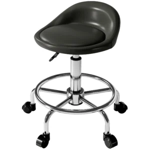 Rolkruk Verstelbaar In Hoogte Met Rugleuning Draaikruk 59-75 Cm Werkkruk 360° Draaibaar Kruk Bureaustoel Voor Kantoor Salon Massage Spa Zwart


